30×30 Direct Watercolor Challenge: Part 1
Sketches around Town
A recap of my sketches and experiences.
This is part 1 of my 30×30 Direct Watercolor challenge recap, read part 2 here!
The 30×30 Direct Watercolor Challenge has been a whirlwind of sketching this month, thank you for your enthusiasm and sharing on Instagram and Facebook! I’ve just finished my last “official” sketch for the month and thought I’d recap of my experience in two parts.
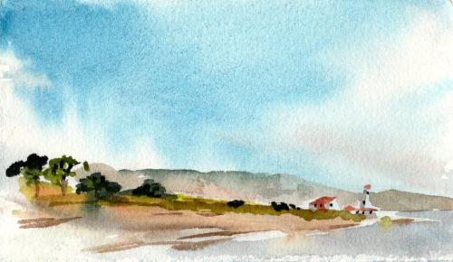
This challenge inspired me to incorporate my sketchbook into my daily explorations of my town and region. I began by heading to Fort Worden in Port Townsend to warm-up. I felt a bit rusty as I sat on the dock in the wind splashing paint on my paper, especially as I forgot little things, like my extra clips and rubber bands for the wind.
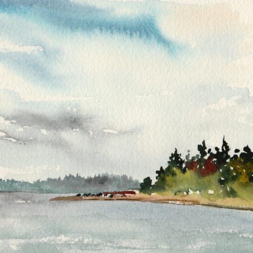
The more I sketched, the more fun I had.
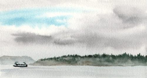
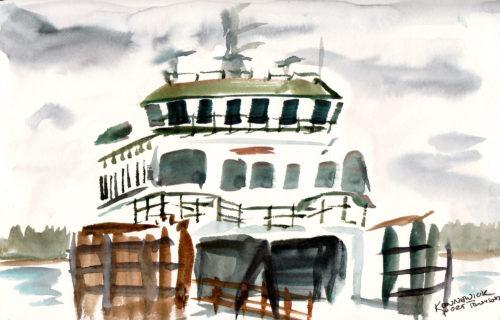
I carried a large Art Toolkit everywhere, and enjoyed diving into my sketchbook with rapid, gestural sketches.
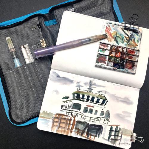
I also experimented with the Direct Watercolor Palette exploring the twelve colors selected by artist (and 30×30 organizer) Marc Taro Holmes.
Often around town I am joined by my enthusiastic daughter.
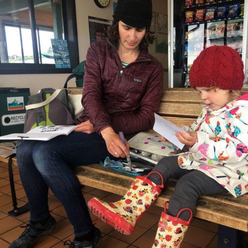
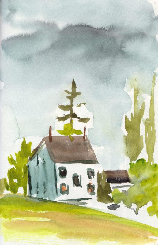
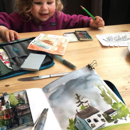
My daughter Stella is nearly 3 and on most days, I am biking her to preschool or grandma’s house, and taking adventures in between.
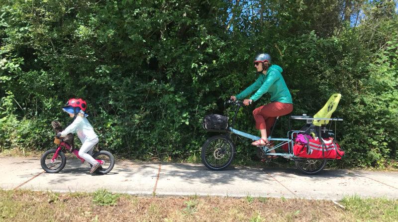
Around a week in, I decided to branch out from the cold-press paper I typically carry in my Art Toolkit, and loaded up our bike with extra art supplies including Arches Hot Press 140 lb watercolor paper. Our bike is a wonderful Bike Friday Haul-a-day built by G&O Family Cyclery in Seattle.
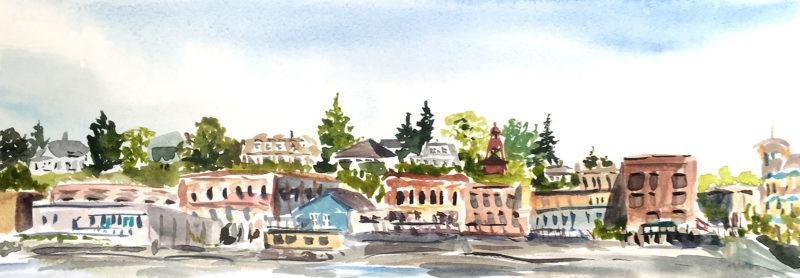
I surprised myself by loving hot press! In my studio, I have always used cold-press paper, preferring the texture and slow drying speed. For plein air direct watercolor, the smooth hot-press surface and rapid drying speed was better suited to my approach.
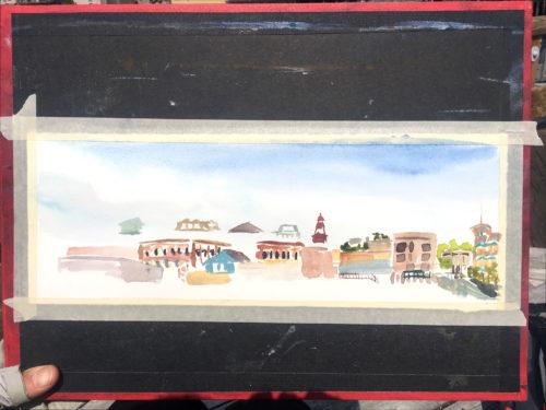
I’ve also really enjoyed Marc Taro Holme’s color selections in the Direct Watercolor Palette. Many are new to me, including the Green Gold, Olive Green, Naples Yellow, and Peryelene Maroon. They were perfect for foliage and buildings, both of which I’ve got limited experience sketching (not so much of them in the polar regions).
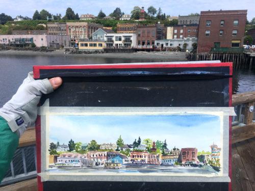
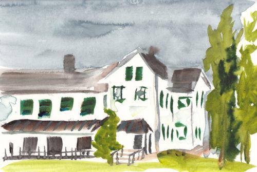
I continued sketching the colorful (and rather charming) buildings around Port Townsend, focusing on speed and broad strokes (using primarily a 1/4″ flat brush).
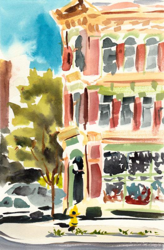
This painting above is one of my favorites from the whole project.
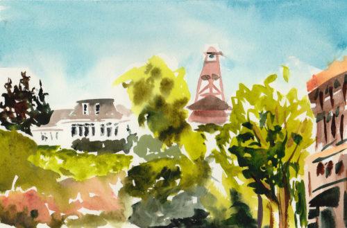
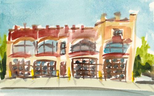
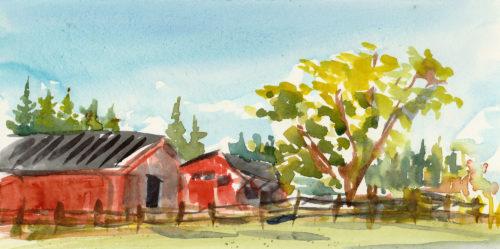
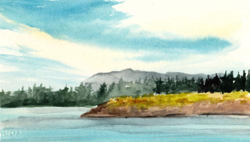
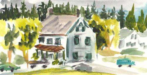
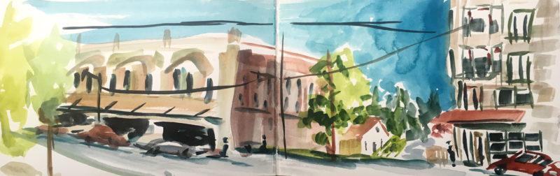
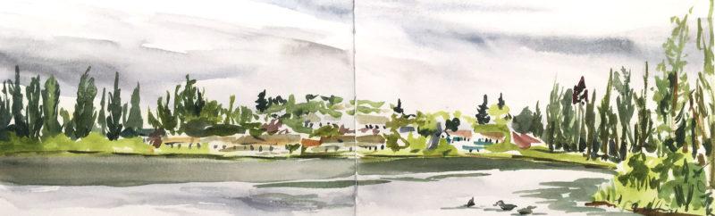
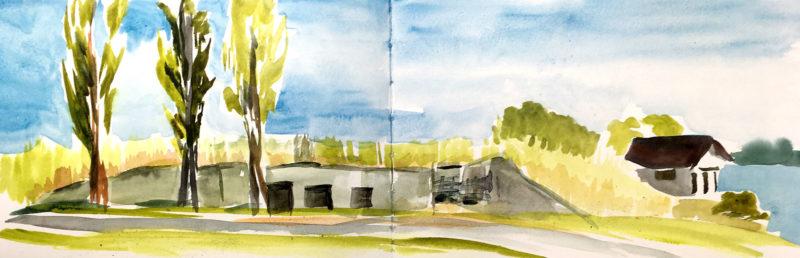
When I didn’t have my art boards with me, I continued to play in my Art Toolkit sketchbook. I can’t resist full page spread panoramas, even when in a hurry!
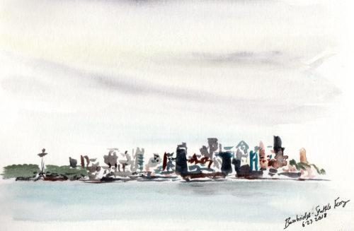
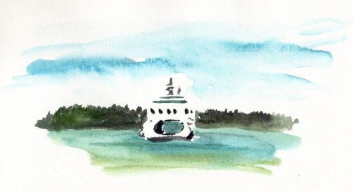
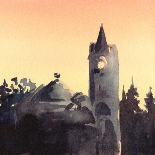
Finally, there were days when I didn’t make it outside to sketch and worked in my studio. While painting the Port Townsend courthouse, I missed having pencil line to define the building.
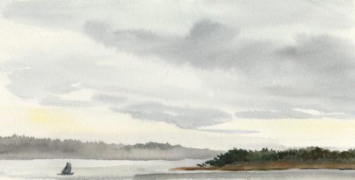
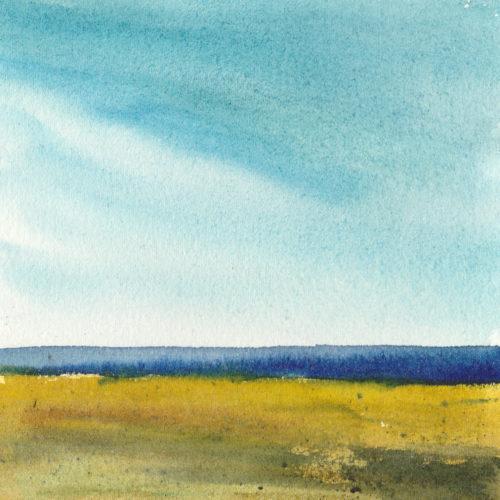
I was more satisfied with this simple sketch of the coastal landscape, just focusing on the elements of land, sky, and water.
I followed this with some sunrise studies, experimenting with the warm yellows and cool blues of early light. These were great practice and I was happier with the rosier version.
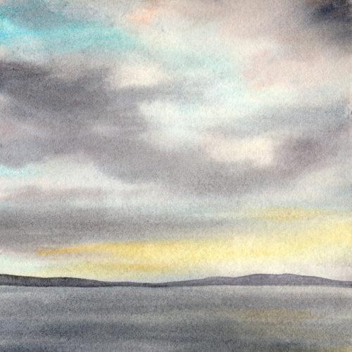
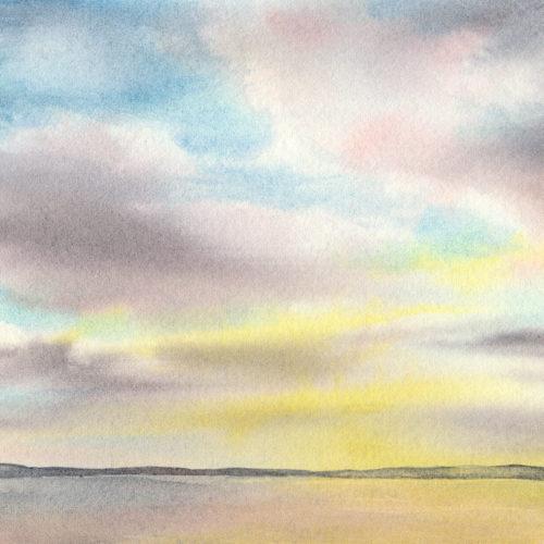
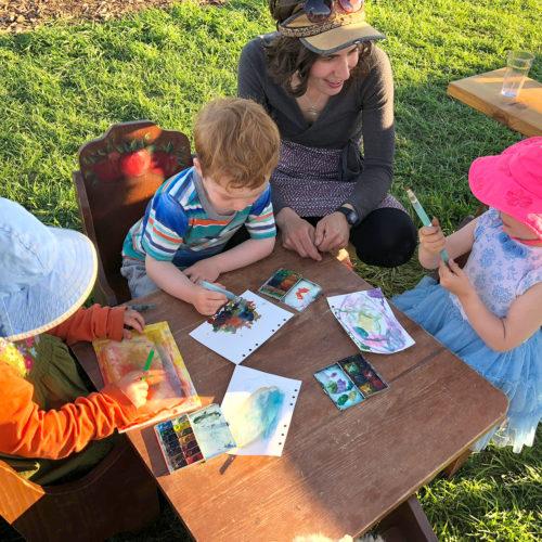
That’s Part 1 of my Direct Watercolor Project, with 23 of 30 completed! I have more confidence with just diving in with paint on paper while working onsite, and practiced letting go of perfect line and accuracy. All in all, this project has been great fun and I’ll end with a photo of an art entourage I picked up while sketching at Finnriver Cidery in Chimacum. Fortunately I always pack extra art supplies!